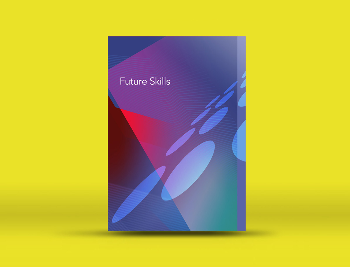
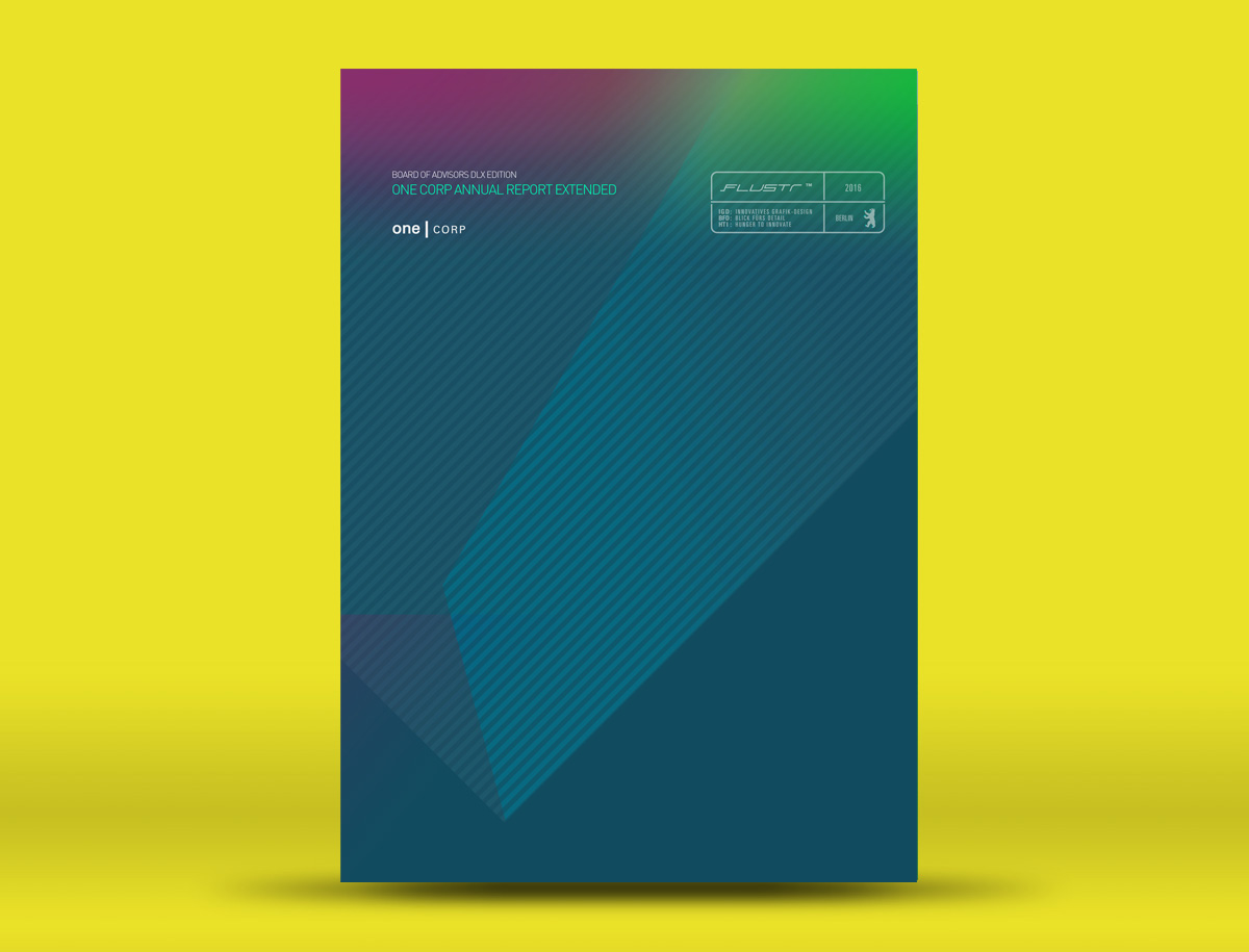
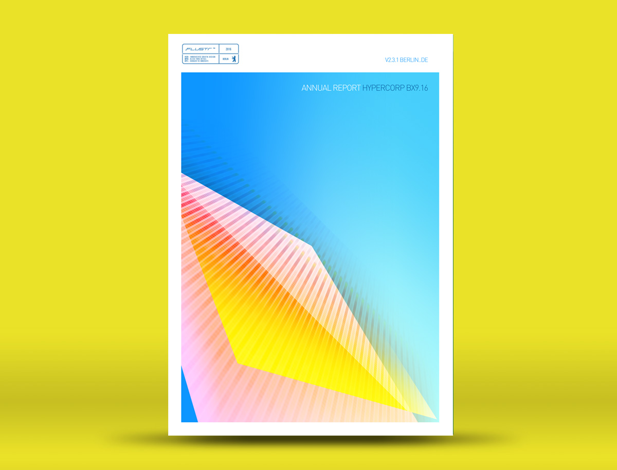
An exercise in Visual Design where I gave myself total creative freedom to experiment with visuals and concepts on cover layouts for technology and future inspired themes
Usually covers for corporate documents of this kind are very serious dull and boring, so I wanted to take that to the extreme opposite using very lively colours and high contrast combinations to create a vibrant look, full of action, full of life.
Corporate dark greens and blues coexist with shades of magenta and accents of a brighter shade of deep blue
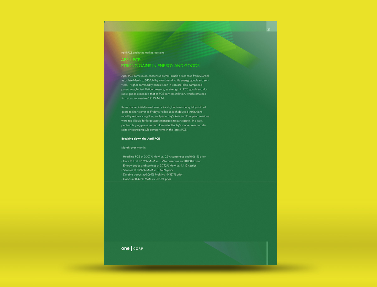
There’s always overload of information in corporate documents, in general people tend to blow up sentences with complex jargon to sound more profesional and fill pages with text so it doesn’t look “empty”. In this case space is allowed to take over and generate a more calm surrpunding for the reader to digest the text and just the right amount of text
Another alternative exploring brighter colours and a clean white frame containing the whole image within the vertical format